Role
Senior Visual Designer
Domain
Energy
Platform
Web
Timeline
Jun 2018 – Jan 2019
Team
Business Goals
- Streamline the enrollment flow so customers could move from campaign landing page to signed contract without confusion or dead ends
- Eliminate the operational overhead of building and maintaining unique landing pages for every marketing campaign
- Reduce call center volume driven by enrollment errors and mid-flow confusion
- Enable the digital sales team to launch campaigns faster with a repeatable, reusable design system
- Improve conversion across affiliate campaigns and evaluate performance across channels
Research & Discovery
The Problem
A flow audit of the existing enrollment process surfaced the core problem visually: a flowchart that illustrated every decision point a customer had to navigate from a campaign landing page to a completed enrollment. The length and branching of that chart — before a single screen was redesigned — became the most persuasive artifact for alignment with development, marketing, and sales.
Where the flow broke
Hover or tap a step — the pink "✎ Enter Zip Code" row shows the action happening on that page; dashed tags mark where users dropped off or called support
Three stages of zip code prompts — to capture intent, then to check eligibility, then to classify residential vs. commercial — each invisible to the customer as anything but the same field, asked again.
Campaign Pages Couldn't Check Eligibility
Banner ads and landing pages were built to convert, not to validate eligibility — they had no way to confirm whether a customer's address actually qualified for the promoted plan. That logic only lived on the home page, so every campaign visitor had to be sent back to start over and enter their zip code a second time.
Residential vs. Commercial Changed the Plans
Eligible plans differ for residential and commercial customers, so the flow needed to classify each customer before it could show real options. That classification required a third zip code entry — to find the right plan type, after already entering it twice just to get this far.
Users Only Saw the Repetition
None of this backend reasoning was visible to customers. What they experienced was the same field, asked again and again, with no explanation — confusion that translated directly into drop-off and calls to the contact center for something that should have been self-serve.
Process & Iteration
First Attempt: Zip Code Gate at the Campaign Level
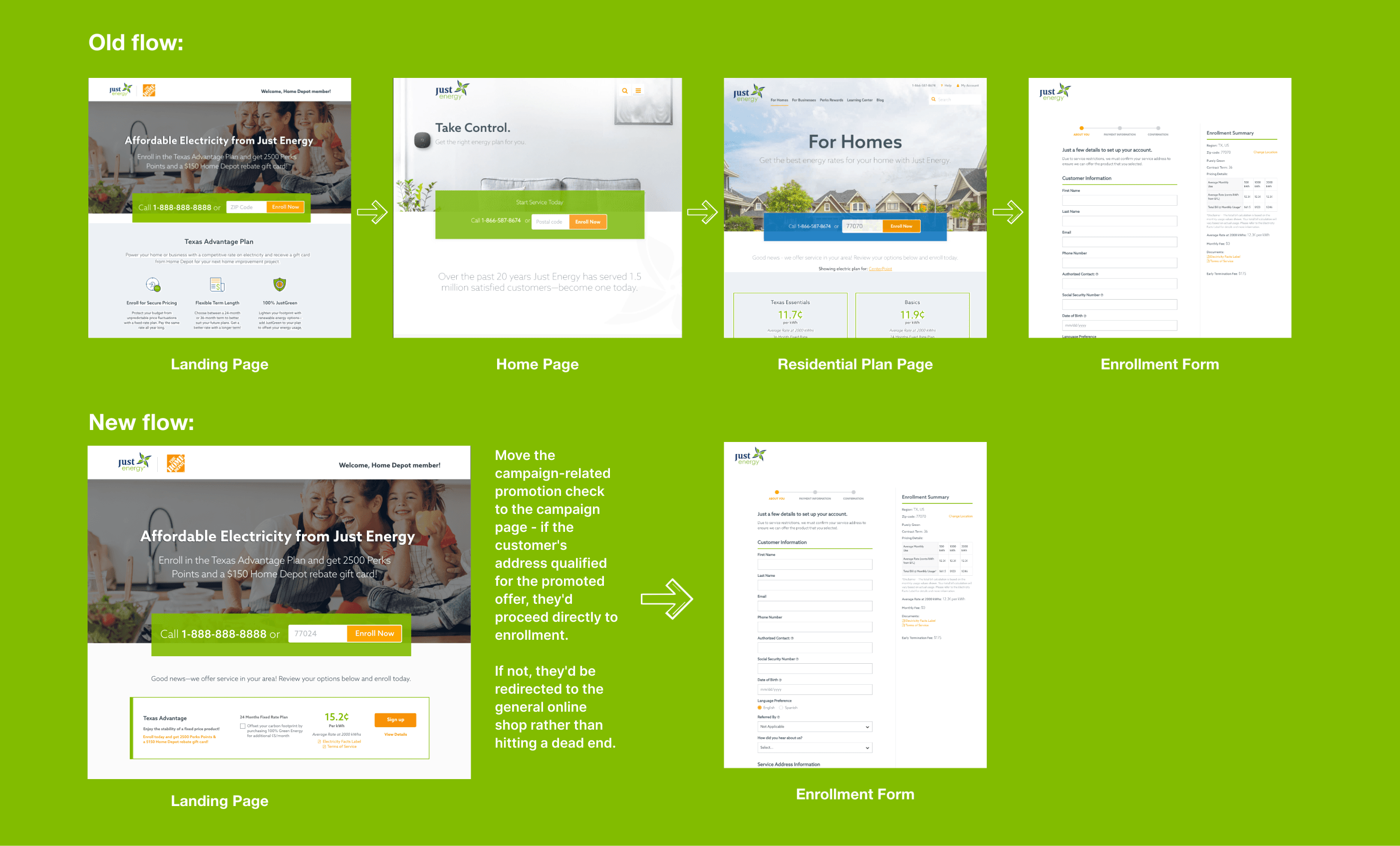
The first solution restructured the flow around a single zip code input at the top of the campaign page. If the customer's address qualified for the promoted offer, they'd proceed directly to product selection. If not, they'd be redirected to the general online shop rather than hitting a dead end.
This cleaned up the flow significantly — redundant steps were removed, and the zip code was collected once rather than repeatedly. It also removed a common trigger for call center contacts, since customers no longer needed to call just to find out whether they qualified.
The Feedback
When the online sales team tried to scale this across hundreds of simultaneous campaigns, the model broke. Each campaign required its own zip code eligibility logic to be maintained — a significant and ongoing development cost. The team also raised a new requirement: if a customer's local offer wasn't available, they wanted to surface the best available alternative, not just redirect. Bundle offers (electricity + gas) also needed to be surfaced contextually.
The Iteration: Dynamic Product Lineup Module
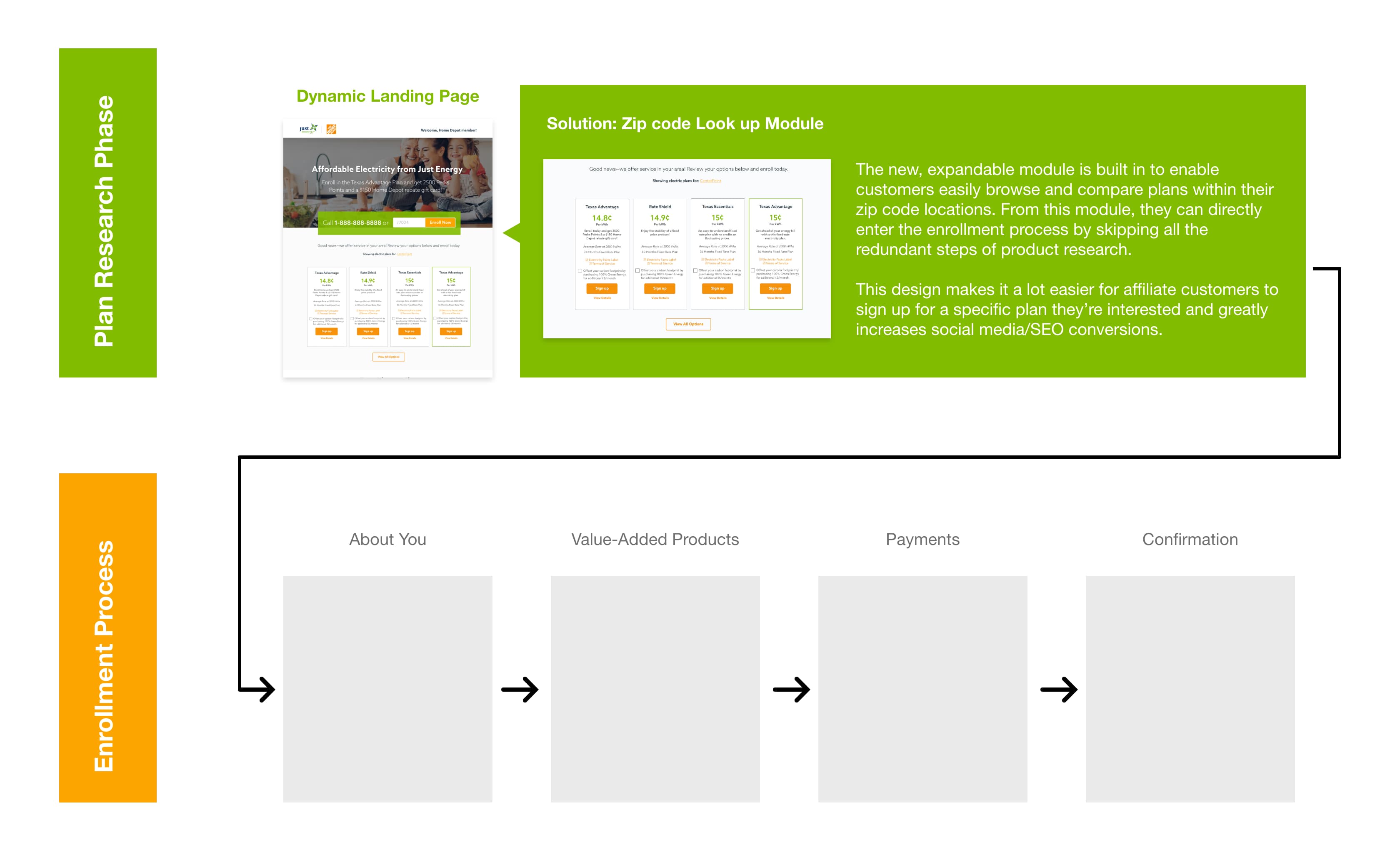
Rather than solving for each campaign individually, we rebuilt the approach around a single reusable module — a dynamic product lineup component that could be embedded into any campaign landing page. The module only needed to be built once. It handled eligibility, surfaced the best available offer for the customer's location, and presented bundle options where relevant — all without any per-campaign configuration.
This shifted campaign creation from a design-and-development effort to a content and configuration task. Landing pages were standardized: header, hero image, product lineup module, key feature sections. All components pre-built. Marketing could launch a new campaign without a new design brief.
Result
A universal, responsive landing page template paired with a dynamic lookup module that could be dropped onto any page — campaign or core — to check commodity availability and plan eligibility from a single zip code entry. The same module replaced the scattered, per-campaign eligibility logic everywhere it lived, so a customer's address only needed to be entered once to see accurate, eligible plans. Visuals and component specs were produced for each variant and documented in Adobe XD for feasibility review with development, marketing, and sales.
Impact
One Streamlined Path
Enrollment moved from a multi-branch, multi-entry-point process to a single path — removing a common reason customers had to call the contact center mid-signup.
Configuration, Not Development
Custom landing page builds per campaign were eliminated. The module surfaced current offers automatically, so pages stayed accurate without manual updates.
Scaled Across Brands
The same reusable template and module extended to affiliated brands acquired across multiple markets, without rebuilding the system each time.
“Sisi was wonderful to work with. She brought in a fresh outlook on design to the organization and was able to be counted on for taking on deliverables of mockups, wireframes and visual assets in a start-up environment. I trust that she will be a positive asset to any team she works with in the future.”
Via LinkedIn · March 30, 2019
Next
Yunmai →